Typography Crash Course

I'm passionate about the world of software development, I never thought that I was going to understand it, but I'm glad that I challenged myself to learn it.
Typography is the graphic representation of the written word.
Throughout history, people expressed their ideas through language. They give them form and shape words. However, memory can only last that much. With time, those who communicated and shared knowledge fated away and so much of their knowledge.
To perpetuate our ideas we started to represent language visually. This changed everything. Not only you could keep the thoughts and ideas longer, but also manipulate them. To play it over and over in your head until you understood what the author was talking about.
Now we can know what someone from different ages and countries was writing about. Communication rise, especially when started to product it quicker like with print or, nowadays, the internet.
Yeah yeah, but why does it matter?
Ideas are influenced by the way they are written. Different styles convey different messages. When the language is spoken we can understand the content and also the way it was delivered. The intention behind that message.
We can't know for sure how the reader will interpret our words.
Words help to communicate a message, good typography helps to connect words. That means that the visual implementation makes it easier to read the content of words, can set a brand apart, or just make the information more accessible overall.
You can make something aesthetically appealing and deliver a good narrative. Set your identity with what you want to tell.
Bad typography can confuse and diverge your content from your message.
So, be sure to pursue aesthetics and meaning in your writings. Because everything is taken into account.
Typefaces and Fonts
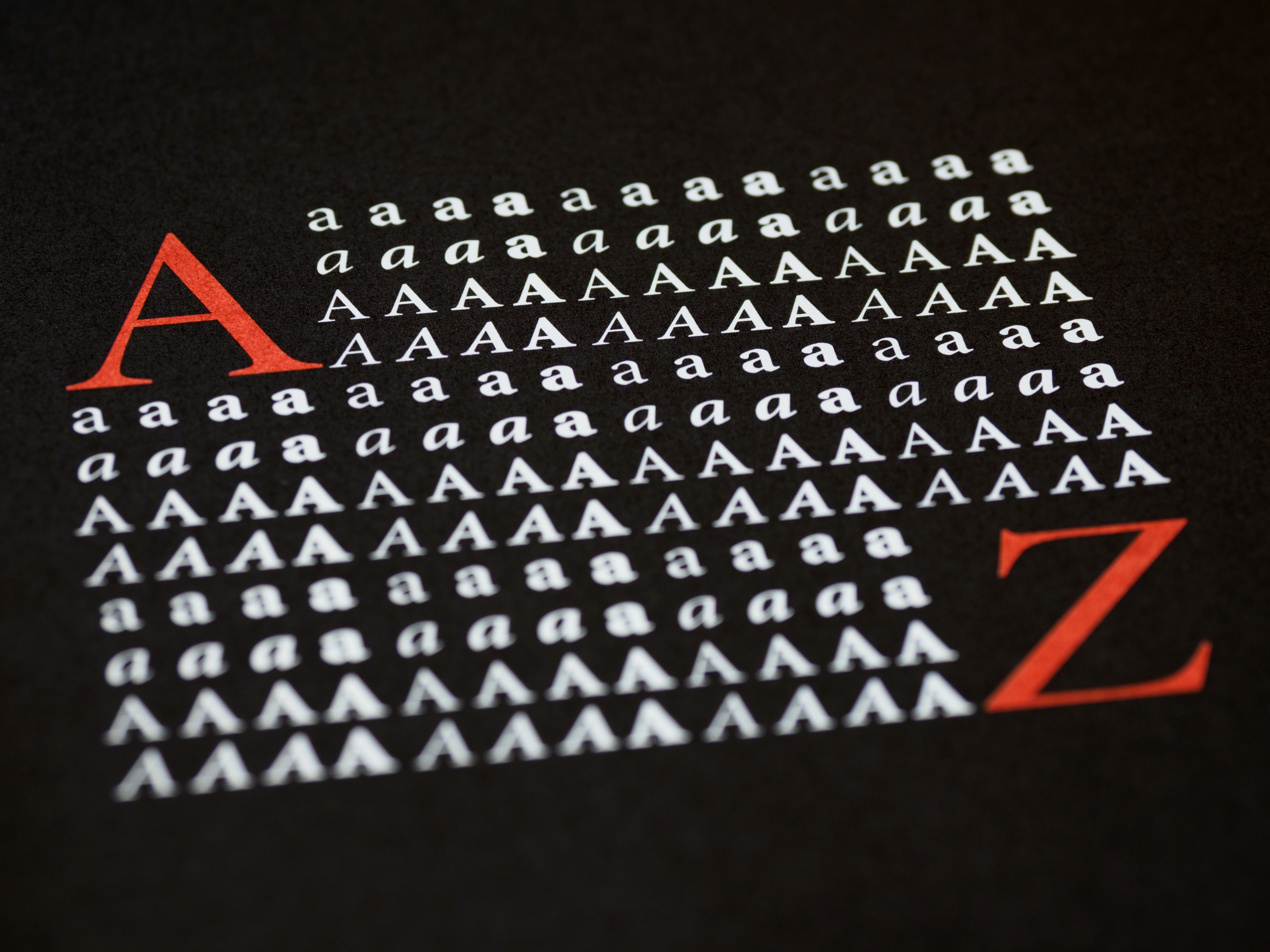
Typefaces
When I talk about typefaces I'm referring to the whole set of letters and symbols that share the same intended design.
Font
Fonts refer to the weight and italic style variations of a typeface. In short, it's an instance of a typeface.
Types of typefaces
Serif
They are typefaces with decoration at the extremes of each letter.
Sans-serif
Typefaces without any decorations at the extremes of each letter.
Monospace
In monospace each letter and symbol update the same space no matter the width of each one.
Scripts
Are hand-written typestyles.

How to choose a typeface or font family
Well, this is the part where I say that it depends. You see, I learn that as much study and analysis typography has, in the end, it's not an exact science. Sometimes you need to try different types and pick the one that gives the message that you want, in the context that you want and the medium that you're in.
Having said that, there are still some things to consider when choosing a typeface like the mood of the message or the medium that it will be seen.
Choosing the right type will make it more accessible for everyone who reads it.
The mood
Formal texts are associated often with serif, but script types can also be formal. And the more casual ones are the sans-serif which are good for context without formalities.
Print vs Digital
It's believed that the serif type will be easier to read on small printed elements like books or newspapers. The sans-serifs are used more often on digital devices and magazines.
White Space
It’s the area between elements.
Although is called whitespace, that doesn’t always need to be white. The main purpose is to allow text to breathe.
Title vs Text
Texts need to be easy to read even on small fonts, things like the height difference between caps and small caps are taken into account, in this case, a lower gap between those two is important for readability.
Titles can have more freedom in that regard, but they need to be trimmed to occupate as much space as possible without breaking into the next line. For that reason, the space between letters can be less than the normal text.
Size, Contrast, and Hierarchy
On the designing of typography, always use relative size units like em (relative to a specific part) or rem (relative to the root font size of the given document).
Contrast
The color of the font and the color of the background are really important to decide the contrast.
A proportion would be between 4.5 for texts and background and 3.1 for titles.
Size
Text
Somewhere between 16px and 24px.
The length of the paragraph is measured on letter count than on absolute sizes. A maximum length would be between 50 to 70 letters per line. But, of course, that depends on the size of the screen. In either case, the idea is to leave whitespace for the content to rest and make it easy to read.
You can use a max length of 30em and work from there.
Tittle
Between 26px and around 40px.
Hierarchy
Hierarchy is the distinction between one element with another, and it is used to guide the reader through the text with different types of emphasis.
You can use size, contrast, whitespace, and fonts to create an organized implementation of the elements.
A good rules of thumb with size is to start with 16px and add an 8x increase (24px, 32px, 40px, etc). But, don't forget the relative units of em and rem.
In contrast, make sure that the colors aren't "too vibrant" with each other.
Alignment
- Centered text can be used in titles, but it’s a good idea on regular text. Remember that text needs to be easy to read. But you can center the block of text on which the content rests.
- Justified alignment is more common in printed media, especially newspapers which need them to divide the content into columns and justify alignment takes advantage of that.
- Left alignment is especially useful for regular text, but it can be used on titles as well.
- Right alignment. Since we read from left to right, I wouldn’t recommend using it. But, like many things, there are exceptions. This isn’t an exact science, so you can experiment if you want.
Finally, choosing the right typography forces you to be conscious about the style, intention, and mood you want to deliver. So don't be afraid to experiment and use what fit into your message.
Follow me on Twitter, LinkedIn, Instagram, Github, Medium (For more opinion based posts), and here on Hashnode and my Hashnode blog.
Have a nice day and until next time. Bye.